
TripZen App
UI/UX Design
TripZen is an intuitive, simple-to-use group travel app created to help reduce the stress of planning group trips. Create custom trip ideas, vote and comment on destinations, and securely store memories afterwards.
Note: This is a real project done with a client but the name and logo of the app are not revealed at the client’s request.
Year
2022
Client
Subrat K
Case Study Index
Hey there! I am happy to see you here.
You can navigate to any particular section through this index, however the real fun is in going through the whole case study!


Project Overview
TripZen is an intuitive, simple-to-use group travel app created to help reduce the stress of planning group trips. Create custom trip ideas, vote and comment on destinations, and securely store memories afterwards. Stay organized and save time:
- Create detailed itineraries
- Share your travel dates, transport, trip activities and accommodation
- Vote, comment and stay on the same page with your group
TripZen keeps the whole group on the same page, from idea sharing to destination voting to trip activities.
Our target audience is people who like to travel in groups but don’t like the hassle of planning it.
TripZen will help them plan their trips with ease without getting into several WhatsApp groups just to decide on where they would stay!
Who are our Target Audience?

What are the user problems we have observed & how are we solving them?
Pain Point 1: Users need a place to plan with their friends without making dozens of WhatsApp groups.
With TripZen, the group can vote on accommodations, destinations, activities, availability etc.
Pain Point 2: Users find it difficult to ask every group member to share images & videos taken during the trip and also the spending every group member did.
Through TripZen, users can create collections of their memories made during trips to one place and share them with their group.

Building a solid foundation through Information Architecture
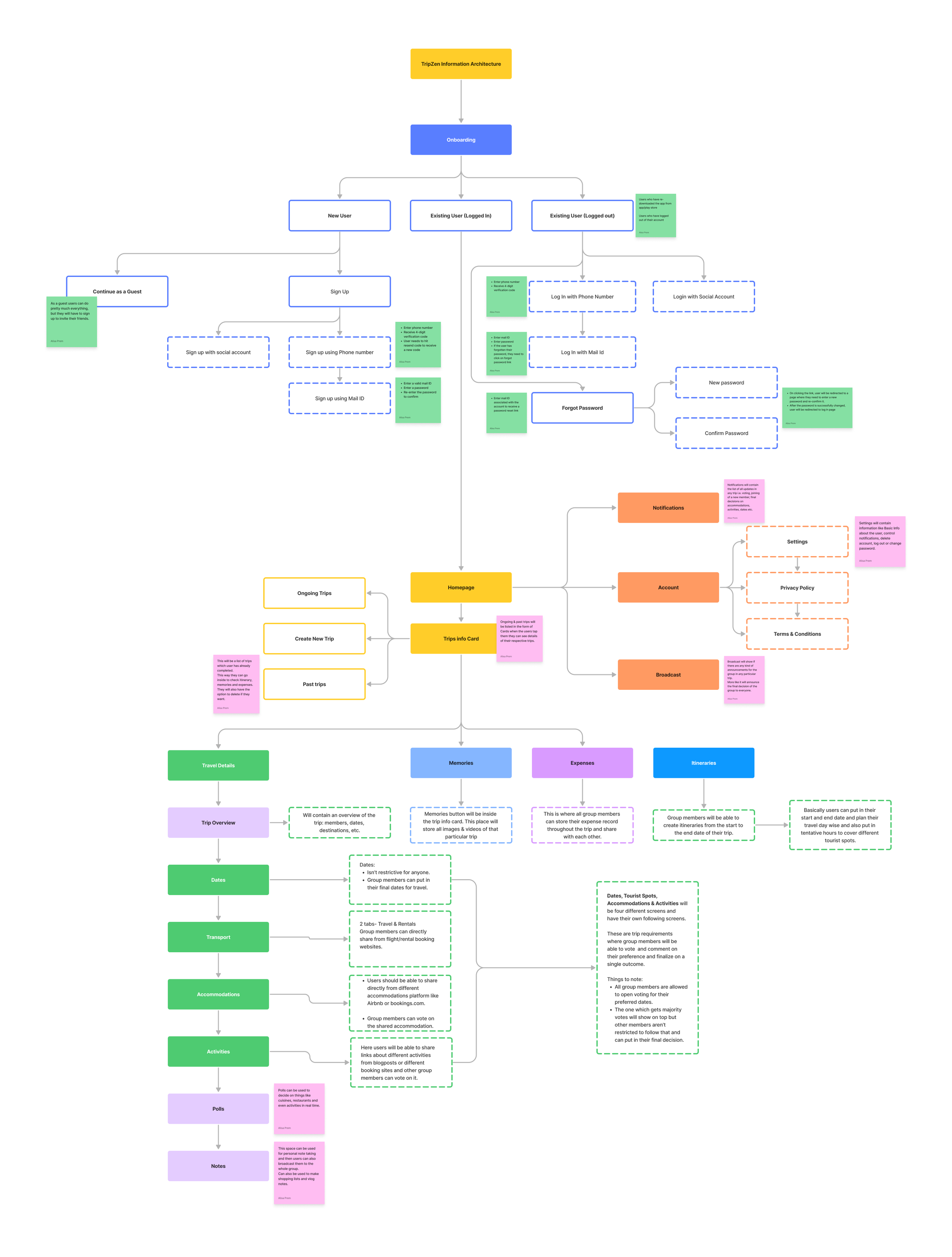
Why is an Information Architecture required?
Information architecture helped organize the data and content into a structure that is user-friendly and easy to navigate. This made the information more accessible resulting in a better user experience.
By considering how users interact with the interface and the content, the information architecture was designed to be intuitive and user-friendly.
It sets the foundation for all subsequent design decisions. It will also ensure that the product’s user interface, content, navigation, and overall user experience are aligned with user goals, needs, and expectations.
I laid out the information architecture according to the client's needs and user pain points. I understood that the app has one prime feature i.e to make planning group trips easier, and the client wished to achieve it through 2 main actions:
Sharing the trip details
To enable this I have added the functionality to directly paste relevant links, upload images/important documents, adding travel dates, and transportation options.Knowing the public opinion
To enable this I implemented the voting system and commenting options for all the shared details by any group member
Keeping the business needs and the user journey in mind I made the architecture crisp and laid down all the important information for the said features to have seamless information flow.
What was my approach?
Making it seamless through Userflow

The app’s navigation and the journey that the user takes play an essential role in determining the user experience.
While working on this user flow I have ensured that even with so many features, the app's navigation is minimal and frictionless and the user can perform the main actions in a few taps, without any information gap.
What was my approach to Userflow?
"We started with nothing but an idea. Throughout the design process, Alisa has been so patient and thoughtful. Her expertise helped me realise this project smoothly"
— Subrat K

Bringing the project to life with
Hi-Fi Wireframes & UI Designs
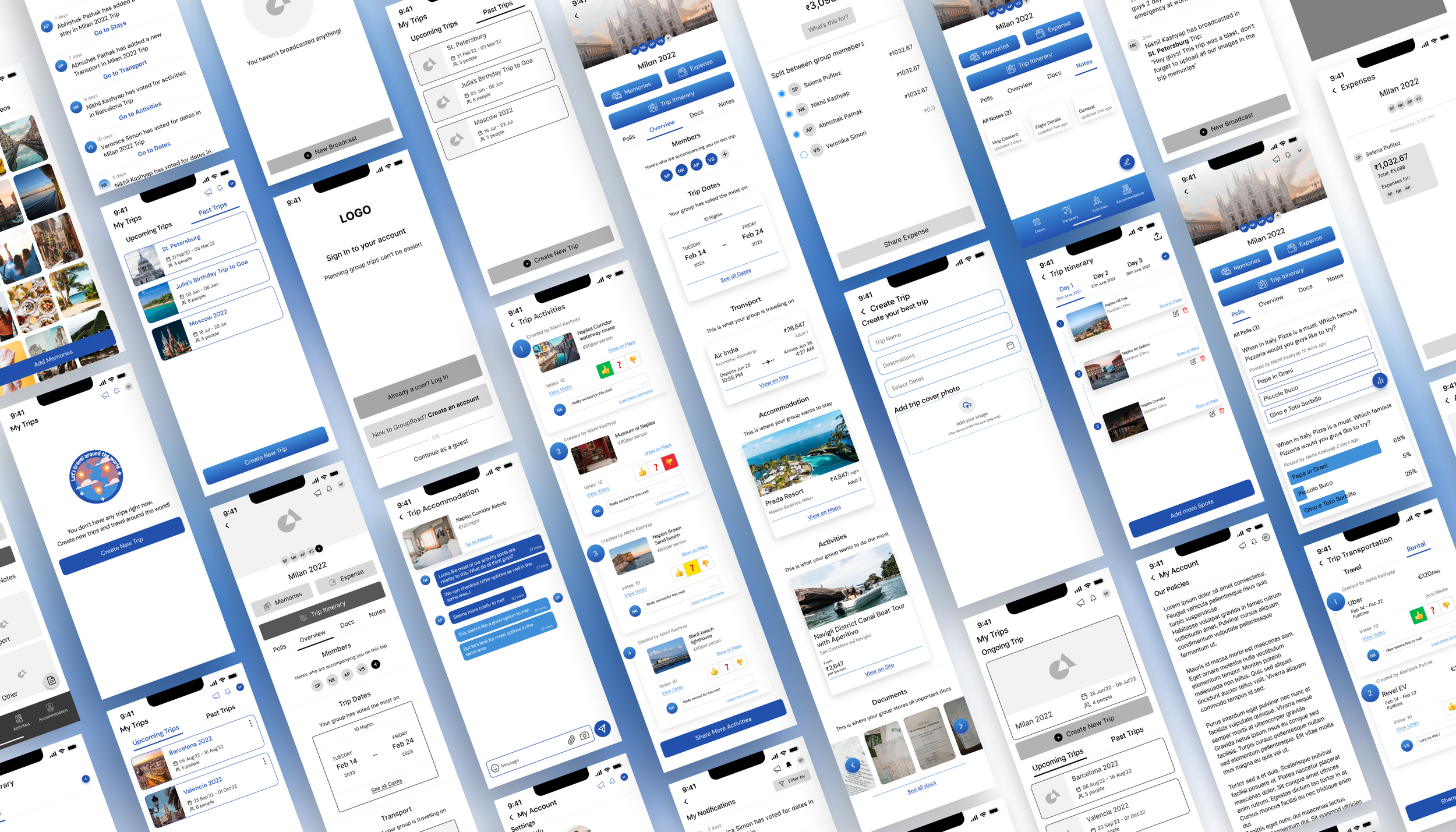
To deep dive into wireframes and UI design which includes more than 70 screens, click here.
Project Takeaway
My Challenges
The biggest challenge for me was to convince the client to go through the process of user research, creation of IA and userflow. They thought this was a waste of time and directly wanted to go through the screens. I made them understand how important it is to go through these processes to create a user-centric product.
The timeline, which was only 4 weeks and 1 week for revisions if there were any. Initially, it made me nervous but as we moved forward and as I got a better understanding of users and the product itself I was able to deliver on time which took me 4.5 weeks.
My Learnings
This was my first experience working on a project from scratch, with a tight deadline and no team support. The thought of working on an incubation product was thrilling as well as challenging.
This project provided me with a significant confidence boost and confirmed that I had chosen the right career path. I have now more belief in my own hard and soft skills such as time and stress management, handling clients and product design.